
Key takeaways
- Activity percentage counts input events, so it rewards typing and clicking, not results.
- Calls, reading, listening and thinking all look like low activity.
- Scoring people on the percentage invites gaming and hurts trust.
- Use work evidence and outcomes first, and keep activity level as context.
What does an activity percentage actually measure?
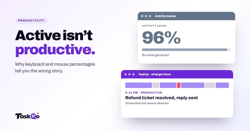
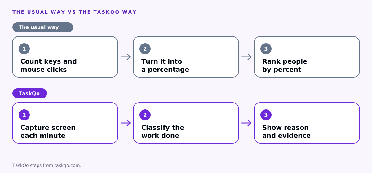
Most time trackers split each tracked period into small slices and check whether the keyboard or mouse was used in each one. The share of slices with input becomes the activity percentage. If a team member touched a key or moved the mouse in most slices, they get a high number.
That makes activity level productivity scores easy to produce and easy to compare, which is why so many dashboards lead with them. But the number only answers one narrow question: was there input? It says nothing about what the input was for, whether it moved a task forward, or whether the work was any good.
A support agent who types a long, careless reply scores well. A colleague who reads the whole ticket history first, then writes a short reply that solves the problem, scores lower. Most managers would rather have the second agent.
Tools also differ in how they slice time and what counts as input, so the same shift can produce quite different percentages in two products. That alone is a reason to be careful about comparing people, or teams on different setups, by this number.
Why activity level is a weak productivity signal
The core problem is that input and output are different things. Input is easy to count, so tools count it. Output depends on the job, so it takes more effort to measure. The percentage fills the gap with something that looks precise but is only loosely connected to results.
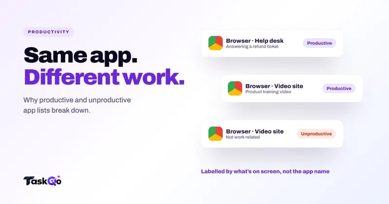
It also cannot tell what the input was for. Scrolling a social feed and scrolling a client's knowledge base produce the same mouse events. Typing in a personal chat and typing in a ticket produce the same key presses. The percentage treats them as equal.
Finally, it is easy to fake. A mouse jiggler, a key-repeat script or simply wiggling the mouse during a video keeps the number high. When the metric is that easy to inflate, it ends up measuring how much people care about the metric. Our guide on how to detect mouse jigglers covers that side in more detail.
Work that looks idle but is not
In call centers, BPOs and support desks, a large part of good work produces very little keyboard or mouse input. A few examples:
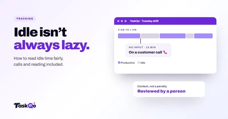
- Phone and video calls. An agent listening carefully to an upset customer may barely touch the keyboard for several minutes.
- Reading. Ticket histories, policy updates, contracts and long email threads all need reading time.
- Thinking and planning. Working out the right answer to a tricky escalation happens in someone's head before it reaches the screen.
- Training and coaching. Watching a training video or reviewing a recorded call is useful work with little input.
- QA review. A reviewer listening to calls and taking occasional notes will always score low.
When these activities score badly, the people doing the most careful work look the least productive. Over time, they either stop doing that work or stop trusting the numbers. Neither outcome helps the team.
What happens when a team is scored on activity
People respond to what they are measured on. If the activity percentage drives reviews, bonuses or warnings, behavior shifts toward keeping the number high.
- Agents rush calls or avoid long, complex tickets because they drag the number down.
- People keep the mouse moving during reading time, which adds nothing.
- Some reach for jigglers or scripts, and the number stops meaning anything at all.
- Good performers who spend time helping colleagues or thinking through problems feel judged unfairly.
Managers also lose something. A dashboard full of high percentages feels reassuring, but it does not tell you which queue is slipping, which client account is behind or which agent needs coaching. The number creates a sense of control without the information that real control needs.
Better signals than activity level for productivity
You do not need to throw activity data away. You need to put it in its place, as context next to signals that are closer to the work itself.
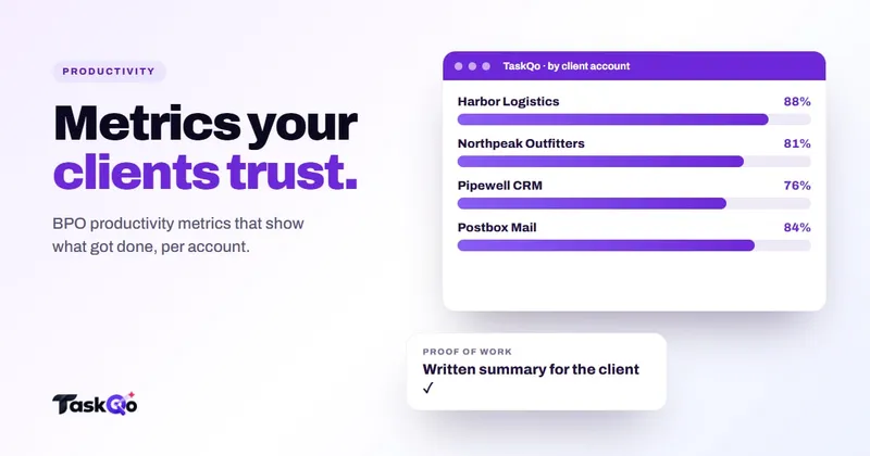
- Outcomes for the role. Tickets resolved, calls handled, cases closed, follow-ups done. Pick the few that matter for each team and client account.
- Quality. Customer feedback, QA scores on calls and reopen rates. Fast work that has to be redone is not productive.
- What the time was spent on. Was the person in the tools the job needs, on the right client's work? This is where screen evidence beats input counts.
- Exceptions, not averages. Long idle stretches, unusual patterns or a sudden drop in output are worth a look. A steady team average rarely is.
- Trends over time. Compare a person with their own past weeks, and a team with itself, before comparing people with each other.
Activity level still helps when it sits next to these. A low number during a stretch with no calls and no output is worth a question. A low number during a long customer call is not.
How TaskQo uses activity level, and what it adds
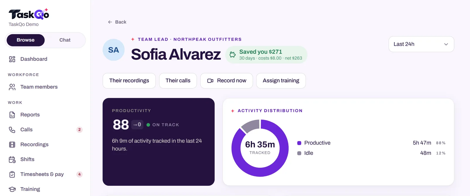
TaskQo keeps activity level, but it is not the verdict. TaskQo captures one screenshot each tracked minute during scheduled shifts. Clear-cut work is classified from the app in focus, AI vision reviews the rest, and every minute is marked productive, unproductive or idle. Classifications come from the screen, not keystrokes.
Each result shows its work: the screenshot, the activity level, the app in focus and a one-line summary of what was on screen. A manager can confirm or change a classification in one click, and the change is logged. Team members see their own timeline, including the reason behind each classification, so nobody is judged by a number they cannot see.
For call-heavy teams, TaskQo can record supported calls and meetings during shifts, with transcripts, QA scores and coaching notes, so call time shows up as work with a quality signal attached. Reports cover productivity, workload and call quality by person, department and client account. Try it in the live demo with sample data, or join the waitlist for early access.
How to move your team off activity scores
If your team is already used to activity percentages, change the measure in the open. A quiet switch looks like a new trap.
- Explain what the old number missed, with a real example from your own team.
- Name the outcome and quality measures that will count from now on.
- Keep activity level visible as context for a while, so people see it no longer drives decisions on its own.
- Give everyone access to their own data, and a way to flag a reading they think is wrong.
Expect a settling-in period. People who learned to keep the number high may need reassurance that slower, careful work is now valued. Team leads should model it by praising a well-handled call or a ticket solved properly, not a busy-looking afternoon. After a few review cycles, the conversation moves from "why was your activity low?" to "what got in the way of the work?", which is the question that actually helps.
Pair this with sensible idle rules. Our guide to tracking idle time fairly explains how to set thresholds that do not punish calls and reading.
Comparing tools: TaskQo vs Hubstaff: AI work analysis or time tracking? · TaskQo vs ActivTrak: workforce analytics or minute-by-minute evidence?.
FAQ
What is a good activity percentage?
There is no universal good number, because it depends on the role. Call, reading and review work naturally score lower, so compare activity with outcomes and quality instead of chasing a target percentage.
Does activity level measure productivity?
Not directly. It measures how often the keyboard and mouse were used, which is loosely related to output. Productivity is better judged by outcomes, quality and what the time was spent on.
Why is my activity low when I am on calls?
Calls involve listening and talking, which produce little keyboard or mouse input. Most activity trackers read that as low activity even though it is real work.
How can managers measure remote productivity fairly?
Agree on clear outcomes for each role, check quality, look at what time was spent on with evidence, review exceptions rather than averages, and let people see and question their own data.
About this guide: written by the TaskQo team. We make TaskQo, a tool that analyzes work inside scheduled shifts, so we mention it where it fits. The advice here works with any tool. Rules on workplace monitoring differ by country and state, so check local law before you change a policy. Questions or corrections: admin@taskqo.com.